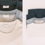
A sweatshirt can be made in almost any color, but not every color performs equally well in real life. Some shades are easy to style, easy to sell, and easy to repeat. Others may look exciting at first but lose value quickly because they feel too seasonal, too limiting, or too hard to match.
The best sweatshirt color is usually the one that balances versatility, market demand, styling ease, and brand identity. In broad commercial terms, black, heather gray, charcoal, navy, cream, and muted earth tones are often the strongest sweatshirt colors because they work across seasons, pair easily with other garments, and support both basics and premium casualwear.
At Fusionknits, we do not judge sweatshirt color by trend alone. We judge it by product role. A core basic sweatshirt should not use the same color logic as a fashion-led oversized drop. A premium minimal crewneck should not always use the same palette as a washed vintage streetwear piece. That is why the best color is not one universal answer. It is the color that best supports the sweatshirt’s purpose.
Why Does Sweatshirt Color Matter So Much?
Color changes the whole commercial life of a sweatshirt. It affects first impression, styling range, repeat wear, category identity, and even perceived quality. The same sweatshirt pattern can feel completely different depending on its color.
Sweatshirt color matters because it influences versatility, emotion, styling value, and market appeal. A strong color makes the sweatshirt easier to wear and easier to sell, while a weak color can narrow its use and reduce repeat purchase potential.
From a product development point of view, color is not just decoration. It is part of the product strategy. A dark neutral may make the sweatshirt feel more premium. A washed tone may make it feel more vintage. A bright seasonal shade may make it feel trend-led but less repeatable.
At Fusionknits, color is always linked to how the sweatshirt will live in the customer’s wardrobe. The best color is usually the one that supports more real use, not only more visual attention.
Why color changes the whole product result
- It affects how easy the sweatshirt is to style
- It changes whether the garment feels basic or fashion-led
- It influences repeat wear value
- It changes seasonality
- It affects brand identity
Why this matters for brands
Color changes category position
A black sweatshirt may feel premium, while the same sweatshirt in a brighter shade may feel more casual or trend-driven.
Color changes customer confidence
Some shades are easier to buy because customers already know how they will wear them.
Color affects collection balance
Core colors and fashion colors should not play the same role.
| Color effect | Product result |
|---|---|
| Strong neutral | Easier repeat wear |
| Trend shade | Stronger short-term interest |
| Washed tone | More vintage or relaxed mood |
| Dark clean shade | More premium appearance |
Is Black the Best Sweatshirt Color Overall?
In many cases, yes. Black remains one of the strongest answers because it is easy to wear, easy to style, and strong across many different sweatshirt categories.

Yes, black is often the best sweatshirt color overall because it is highly versatile, visually clean, easy to match, and commercially stable. It works well in basics, premium casualwear, oversized streetwear, athleisure, and branded collections.
Black also helps the sweatshirt feel sharper and more structured. It often makes the rib, neckline, and silhouette feel more controlled. In many wardrobes, black is the safest color because it pairs easily with denim, cargos, joggers, shorts, and outerwear.
At Fusionknits, black is usually one of the strongest core colors because it serves so many functions at once. It can feel minimal, sporty, mature, or street-led depending on the fabric and fit.
Why black performs so well
- Easy to match
- Strong premium feel
- Clean silhouette effect
- Strong in all seasons
- Broad gender and age appeal
Why black often leads commercial ranges
It reduces styling risk
Customers know how to wear it immediately.
It works across different fits
A slim sweatshirt and an oversized sweatshirt can both perform well in black.
It suits many brand identities
Minimal, graphic, and lifestyle brands can all use black effectively.
| Color | Main strength |
|---|---|
| Black | Strongest broad-use sweatshirt color |
| Washed black | More vintage and fashion-led version |
| Soft black charcoal mix | Slightly less harsh, still versatile |
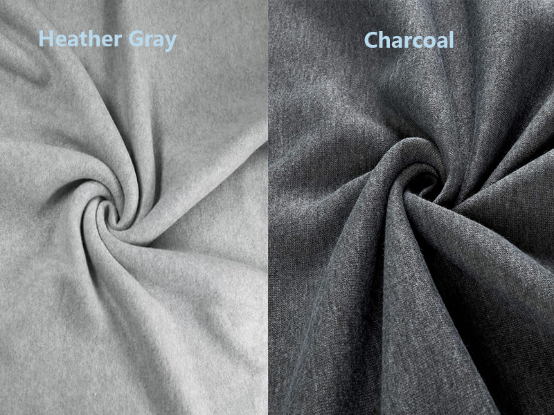
Is Heather Gray the Most Classic Sweatshirt Color?
Yes, in many ways it is. Heather gray is one of the most recognizable sweatshirt colors because it has deep roots in sportswear, basics, and casual comfortwear.
Heather gray is one of the most classic sweatshirt colors because it feels relaxed, familiar, and easy to wear. It is especially strong in crewneck sweatshirts, fleece basics, and comfort-led casualwear because it carries a natural sportswear identity.
Heather gray often feels softer and less severe than black. It can also show texture and fleece character more clearly. This makes it especially useful in relaxed basics, vintage-inspired garments, and everyday comfort collections.
At Fusionknits, heather gray is often one of the first colors we recommend in sweatshirt programs because it creates immediate category clarity. Customers understand it quickly.
Why heather gray stays so strong
- Classic athletic heritage
- Easy everyday wear
- Good with denim, navy, black, and white
- Works well in fleece and terry
- Strong comfortwear message
Why it remains a core bestseller
It feels approachable
The color usually looks relaxed without looking dull.
It supports broad styling
The sweatshirt can move easily across casualwear and loungewear.
It suits many age groups
It does not feel too trend-specific or too formal.
| Color | Main use strength |
|---|---|
| Heather gray | Strongest comfort-led classic |
| Light gray marl | Soft easy basic |
| Mid gray | Broad casual use |
Is Charcoal Better Than Heather Gray for a More Premium Look?
Often yes. Charcoal sits between black and gray, which gives it an interesting advantage. It keeps much of gray’s flexibility while feeling slightly cleaner and more refined.
Yes, charcoal is often better than heather gray when the goal is a more premium or more polished sweatshirt look. It feels quieter, more mature, and more structured while still staying highly wearable and versatile.
Charcoal also works especially well in denser fleece, loopback cotton, and premium minimalist sweatshirts. It can feel more elevated than light gray because it reduces the casual softness that heather gray naturally carries.
At Fusionknits, charcoal is one of the strongest colors for brands that want a sweatshirt to feel understated but still more refined than a standard sportswear basic.
Why charcoal feels more elevated
- Darker and cleaner than light gray
- Less sporty than heather gray
- Strong in premium basics
- Easy to style with black, cream, navy, and olive
- Better visual sharpness
When charcoal works best
Premium basics
Charcoal supports cleaner silhouettes and stronger finishing.
Minimal collections
It feels intentional without needing decoration.
Mature casualwear
The color suits more refined daily dressing.
| Color | Main visual identity |
|---|---|
| Heather gray | Classic and sporty |
| Charcoal | More polished and premium |
| Dark charcoal | Very refined casual basic |
Yes. Navy is often overlooked because black and gray get more attention, but navy is one of the most useful long-term sweatshirt colors in the market.
Yes, navy is one of the best underrated sweatshirt colors because it is versatile, soft, clean, and easier to wear than many fashion shades. It works especially well in premium basics, schoolwear, resort casualwear, and everyday relaxed collections.
Navy carries less visual severity than black, which often makes it feel slightly more approachable. It also works very well with white, cream, gray, khaki, olive, and denim. That broad compatibility gives it strong repeat-wear value.
At Fusionknits, navy is one of the most dependable expansion colors after black and gray because it adds depth without adding risk.
- Strong styling flexibility
- Softer than black
- Cleaner than many mid-tone colors
- Good in both casual and premium ranges
- Broad appeal across markets
Why brands should use it more
It has long shelf life
Navy does not depend heavily on one season.
It supports many fabric types
Fleece, terry, and loopback all perform well in navy.
It feels stable and wearable
Customers trust navy the same way they trust black and gray.
| Color | Main strength |
|---|---|
| Navy | Quiet versatile core color |
| Washed navy | Vintage relaxed mood |
| Deep midnight navy | More premium look |
Are Cream, Ecru, and Off-White Good Sweatshirt Colors?
Yes, but they require more control. These tones can feel premium, clean, and modern, but they are usually less forgiving than darker neutrals.

Cream, ecru, and off-white can be excellent sweatshirt colors because they create a softer premium look and fit well in minimal, resort, and elevated casual collections. However, they are usually more maintenance-sensitive and less forgiving in high-use environments.
These shades often feel luxurious in dense fleece, loopback cotton, or premium terry. They also pair beautifully with olive, navy, brown, charcoal, and washed denim. The challenge is that lighter colors show stains and wear more quickly, so they work best when the product category supports that lifestyle.
At Fusionknits, we often use these tones in premium basics and fashion-led collections where the customer expects a cleaner visual mood and is comfortable with slightly higher care attention.
- Soft and modern appearance
- Strong in minimal styling
- Good with earth tones and dark basics
- Strong visual contrast against darker bottoms
- Works well in clean branding programs
Why they still require caution
They show dirt more easily
This can reduce repeat use in some customer groups.
Fabric finish becomes more visible
Weak surface quality is easier to notice in pale shades.
They suit some categories better than others
A premium crewneck may work better in cream than a schoolwear sweatshirt.
| Color | Main role |
|---|---|
| Cream | Soft premium neutral |
| Ecru | Natural clean basic |
| Off-white | Minimal elevated styling |
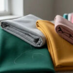
Are Olive, Brown, and Earth Tones Better for Lifestyle Sweatshirts?
In many cases, yes. Earth tones have become much stronger because they offer variety without losing wearability. They feel more directional than gray, but still more stable than bright fashion colors.
Olive, brown, taupe, and other earth tones are excellent sweatshirt colors for lifestyle collections because they feel grounded, modern, and easy to style. They often work especially well in washed sweatshirts, premium casualwear, resortwear, and outdoor-inspired collections.
Earth tones usually pair well with denim, black, cream, navy, and other muted shades. That makes them useful when a brand wants more visual richness without moving into a high-risk color story.
At Fusionknits, olive is often one of the strongest non-core sweatshirt colors because it behaves almost like a neutral. Brown and taupe also work well when the fabric and silhouette support a more mature or premium direction.
Why earth tones are growing in strength
- Richer than basic gray
- More wearable than bright seasonal tones
- Good in washed and vintage products
- Strong with natural-fiber-looking fabrics
- Useful in outdoor and resort styling
Which earth tones work best
Olive
One of the easiest expansion colors in casualwear.
Brown
Strong in premium and heritage-inspired collections.
Taupe
Useful in minimal and more refined sweatshirt programs.
| Color | Best role |
|---|---|
| Olive | Lifestyle and utility basic |
| Brown | Rich mature casualwear |
| Taupe | Premium soft neutral |
Are Bright Sweatshirt Colors Ever the Best Choice?
Sometimes, but usually not as the main core answer. Bright colors can be powerful in the right role, but they are often more seasonal, more trend-sensitive, and harder to repeat in daily wear.
Bright sweatshirt colors can be the best choice when the product is trend-led, youth-driven, graphic-focused, or brand-identity-based. However, they are usually less versatile than black, gray, navy, or earth tones, so they work better as accent colors than as the whole foundation of a sweatshirt line.
Bright red, cobalt, kelly green, strong pink, and saturated orange can all perform well in the right collection. But they usually need stronger category support. They are best when the sweatshirt is intentionally expressive rather than broadly foundational.
At Fusionknits, we usually recommend using bright colors in smaller planned roles instead of building a whole sweatshirt program around them unless the brand identity clearly demands it.
When bright colors work best
- Graphic sweatshirts
- Youth fashion
- Limited drops
- Sports-inspired programs
- Seasonal capsule collections
Why they are not always the strongest core choice
Harder styling
Customers may wear them less often.
More trend-sensitive
The color can lose momentum faster.
More specific market appeal
Not every buyer wants statement color in a sweatshirt.
| Color type | Best collection role |
|---|---|
| Bright red or blue | Graphic or sports-led piece |
| Strong green or orange | Limited statement style |
| Core neutral | Everyday bestseller |
Which Sweatshirt Color Is Best for Most Brands?
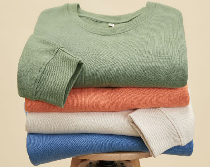
For most brands, the answer is not one color only. It is a color structure built around dependable core shades and a few well-chosen expansion colors.
For most brands, the best sweatshirt colors are black, heather gray, charcoal, and navy as core shades, then cream, olive, brown, or seasonal washed tones as supporting colors. This gives the range both stability and enough variety to stay visually strong.
A brand that builds only on trends can become unstable. A brand that uses only one neutral can become flat. The strongest color strategy usually begins with repeatable core colors and then grows through richer but still wearable accents.
At Fusionknits, this balance usually creates the best sell-through because it respects both customer habits and design freshness.
Strong color structure for a sweatshirt line
- Black for universal versatility
- Heather gray for comfort-led basics
- Charcoal for premium casualwear
- Navy for understated range depth
- Cream for elevated softness
- Olive or brown for lifestyle expansion
Why this works so well
Core shades carry the volume
They support the largest part of the business.
Expansion shades add freshness
The line stays interesting without becoming unstable.
Styling logic remains clear
Customers can understand how the colors fit together.
| Collection role | Best color direction |
|---|---|
| Core bestseller | Black or heather gray |
| Premium basic | Charcoal or navy |
| Elevated neutral | Cream or ecru |
| Lifestyle expansion | Olive or brown |
How Should Buyers Decide Which Sweatshirt Color Is Best for Their Product?
The strongest answer comes from product role. A washed oversized streetwear sweatshirt does not need the same color logic as a premium minimal crewneck. The color should match what the sweatshirt is trying to be.
Buyers should decide the best sweatshirt color by matching the shade to the sweatshirt’s fit, fabric, customer, and category purpose. Core basics usually perform best in black, gray, charcoal, and navy, while washed fashion pieces, resort sweatshirts, and lifestyle collections can support cream, olive, brown, and selected seasonal colors more effectively.
At Fusionknits, we usually ask simple but important questions first. Is the sweatshirt for repeat daily wear? Is it a premium basic? Is it fashion-led? Will the customer want to style it many times? Once those answers are clear, the color choice becomes much easier and much more accurate.
Better buyer questions
- Is the sweatshirt a core basic or a statement piece?
- Will the customer wear it often or occasionally?
- Does the fabric look better in dark or light shades?
- Is the product premium, sporty, vintage, or relaxed?
- Does the color support the brand identity?
Why this approach works
It reduces guesswork
The color becomes part of product strategy.
It improves sell-through
The sweatshirt feels easier to buy and wear.
It supports stronger collections
The range becomes more balanced and more useful.
| Product type | Best color direction |
|---|---|
| Core fleece basic | Black, gray, navy |
| Premium minimal crewneck | Charcoal, cream, navy |
| Washed oversized sweatshirt | Washed black, olive, brown |
| Trend-led capsule | Accent color plus core neutral |
Conclusion
The best sweatshirt color depends on the product role, but the strongest overall answers are usually black, heather gray, charcoal, navy, cream, and muted earth tones like olive and brown. Black is often the best all-around choice because it is highly versatile, clean, and commercially stable.
Heather gray remains the most classic comfort-led sweatshirt color. Charcoal feels more premium, while navy is one of the best underrated options for long-term wearability. Cream and ecru work especially well in elevated minimal collections, and olive or brown are strong expansion shades when a brand wants more richness without losing practicality.
At Fusionknits, the best sweatshirt color is never chosen by trend alone. It is chosen by how well it supports the fabric, the fit, the collection role, and the customer’s real styling habits. When brands build sweatshirt color assortments around repeat wear first and fashion variation second, they create products that are easier to style, easier to sell, and much stronger over time.